Spacing
To ensure a consistent use of spacing that also enables the user to scan and understand information quickly throughout the website, a spacing system of 4px is used. Nested elements use less spacing compared to elements that are separate from eachother and grouped differently.
Spacing system
Token | px | Example | |
|---|---|---|---|
none | 0 | 0 | |
4px | 4px | 4px | |
6px | 6px | 6px | |
8px | 8px | 8px | |
12px | 12px | 12px | |
16px | 16px | 16px | |
20px | 20px | 20px | |
24px | 24px | 24px | |
32px | 32px | 32px | |
40px | 40px | 40px | |
48px | 48px | 48px | |
64px | 64px | 64px | |
80px | 80px | 80px | |
96px | 96px | 96px | |
112px | 112px | 112px | |
128px | 128px | 128px | |
144px | 144px | 144px | |
160px | 160px | 160px | |
Spacing for pages
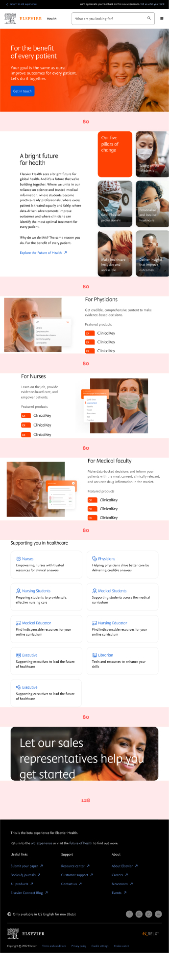
Overview of most common used margin and how this translated in each breakpoint accoringly. As a general rule of thumb, use larger spacing for main pages (i.e. home, landing pages). Use smaller spacing for detail pages (i.e. article, webinar pages)
Desktop spacing
Range 64 - 192px
Token | px | Example | |
|---|---|---|---|
160px | 160px | 160px | |
Tablet spacing
Range 40 - 128px
Token | px | Example | |
|---|---|---|---|
80px | 80px | 80px | |
Mobile spacing
Range 40 - 128px
Token | px | Example | |
|---|---|---|---|
64px | 64px | 64px | |
80px | 80px | 80px | |
Example pages
Below you can see an example how the spacings are applied within components in each breakpoints. Depending on the type of component you can adjust accordingly.


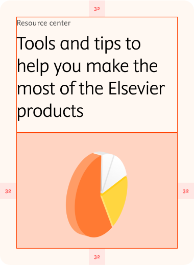
Margins and padding for components
Overview of most common used margin and how this translated in each breakpoint accoringly. As a general rule of thumb, use larger spacing for larger components (i.e. headers). Use smaller spacing for smaller components (i.e. buttons, cards).
Desktop spacing
Range 24 - 60px, most often between 24 - 40px
Token | px | Example | |
|---|---|---|---|
24px | 24px | 24px | |
32px | 32px | 32px | |
40px | 40px | 40px | |
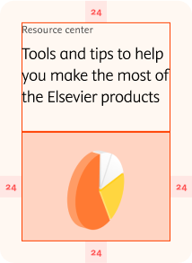
Tablet spacing
Range 12 - 40px, most often between 16 - 32px
Token | px | Example | |
|---|---|---|---|
20px | 20px | 20px | |
32px | 32px | 32px | |
Mobile spacing
Range 12 - 40px, most often between 16 - 32px
Token | px | Example | |
|---|---|---|---|
16px | 16px | 16px | |
24px | 24px | 24px | |
Example components
Below you can see an example how the spacings are applied within components in each breakpoints. Depending on the type of component you can adjust accordingly.
Desktop (L)
Tablet (M)
Desktop (L)

Tablet (M)

Mobile (S)