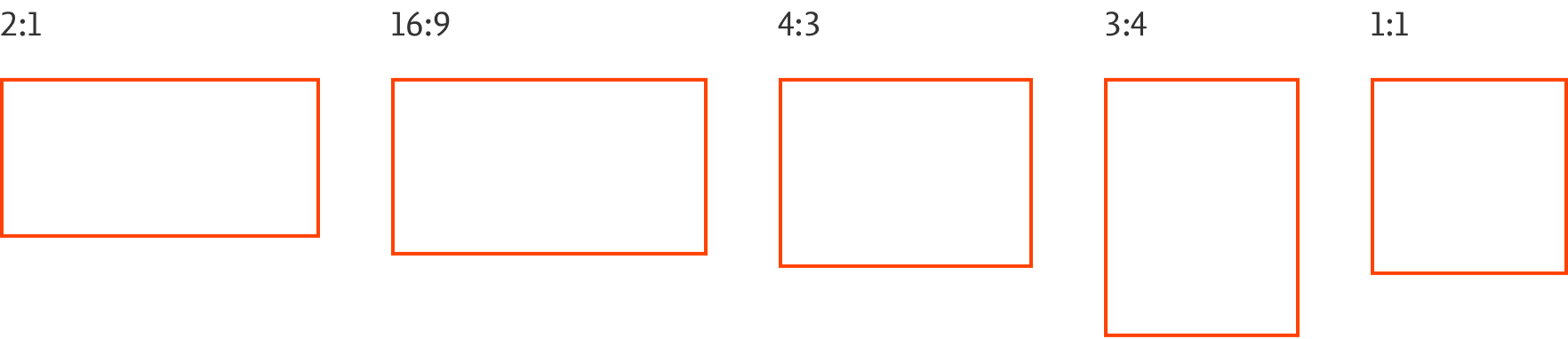
Aspect ratios
To achieve visual consistency and cohesion across our designs, we use the following aspect ratios. When cropping images, use a common 2:1, 16:9, 4:3, 3:4, 1:1 aspect ratio. We have a few exceptions to this rule specified for a particular format. These common aspect ratios work well with our 4px foundation used across the design system for spacing, grid, typography and more.
Additional Aspect Ratios by Combining Multiple 2:1 Building Blocks
Each of the following aspect ratios are created by combinining 2:1 building blocks. This create visual rhythm with our 4px foundation.
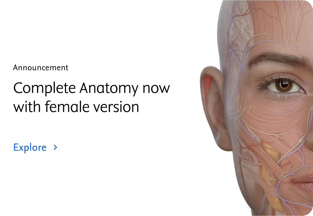
16:9 Ratio example components


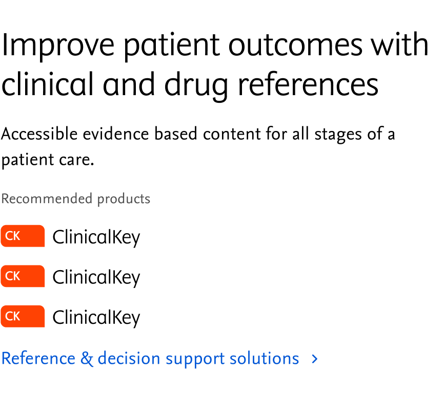
4:3 Ratio example components


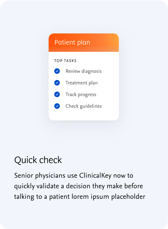
3:4 Ratio example components


1:1 Ratio example components


Exceptions to common aspect ratios
Some components have exceptions to the common aspect ratios we’ve defined. For example the header and banner use a full background image, therefore the aspect ratio is defined by the size of the component itself.


