Shadows
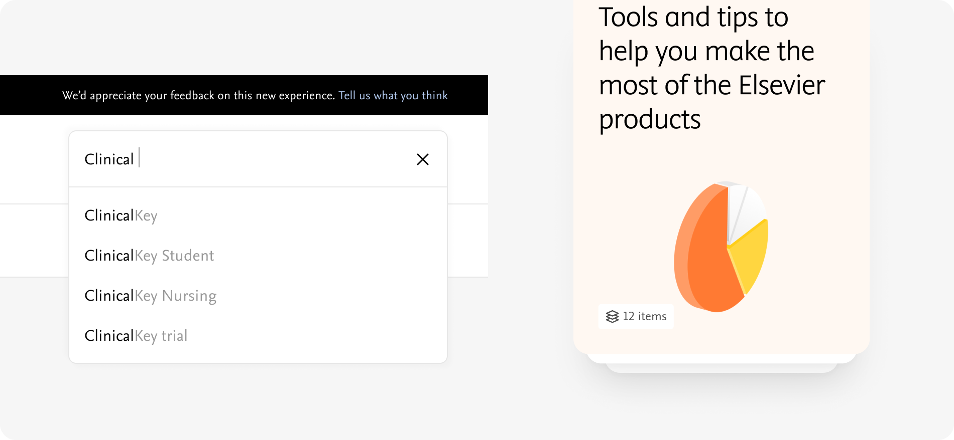
To show hierarchy of different elements on the page, shadows are used in the design. A few examples of elements with shadows are cards, rich icons, pop-ups.

Values
primary-extra-small
box-shadow: 4px 4px 4px rgba(51,51,51,0.02), -4px -4px 4px rgba(51,51,51,0.02)
primary-small
box-shadow: 0px 4px 4px rgba(51,51,51,0.02), 0px 10px 40px rgba(51,51,51,0.1)
primary-large
box-shadow: 0px 4px 10px rgba(51,51,51,0.06), 0px 20px 80px rgba(51,51,51,0.2)
Examples
primary-large

primary-large

Do's and don'ts

Do
Use shadow according to their scale

Don't
Use a large shadow on a small component