Layout and grid
Our designs are built to be responsive. We use a consistent, flexible grid that adapts to content and components across various screen sizes and devices. This allows for alternative input types and dynamic layouts.
Breakpoints
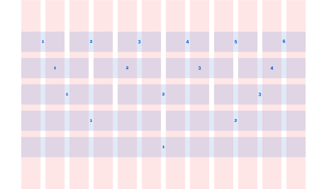
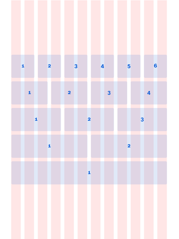
We have 3 breakpoints defined, one for each viewport size. We use a 12 column grid for desktop and tablet, and a 6 column grid for mobile. To provide the best possible user experience, we have optimised components per breakpoint to ensure legibility and adaptability across layouts.
Widescreen (XL) | Desktop (L) | Tablet (M) | Mobile (S) | |
|---|---|---|---|---|
> = 1200px | > = 1024px | > = 650px | < 650px | |
12 columns | 12 columns | 12 columns | 6 columns | |
130px margins | 130px margins | 48px margins | 24px margins | |
20px gutter | 20px gutter | 16px gutter | 12px gutter | |
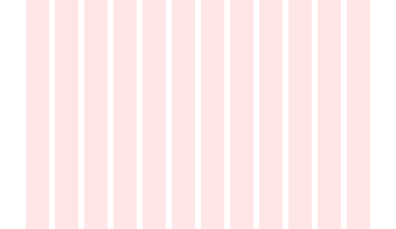
Desktop (L)
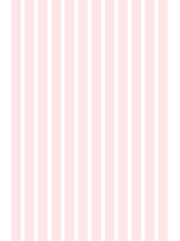
Tablet (M)
Mobile (S)
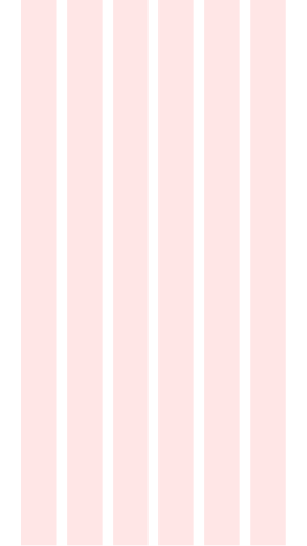
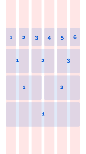
Grid template columns
Components can scale across sizes and environments and reflow at various widths, while maintaining their form and hierarchy.
Desktop (L)
Tablet (M)
Mobile (S)
Maximum width
The maximum width we have defined for our designs is 1600px. After this size, all components would sit centred on the grid, leaving white space beyond it. Here are examples of the header component with a max width of 1600px.