Icons
Icons are essential in our designs. They are used to provide the user with more clarity on items, acting as another visual indicator alongside text. They can also function as a link when space for text is limited. Commonly used icon examples throughout web design are a hamgburger menu, search, chevron, download, social icons. Within the Elsevier.com Design System, we have more specific icons such as the persona icons.

Sizing
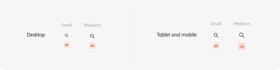
There are two sizes of icons: small and medium. For each breakpoint the icon sizes differ. The small size is 16x16 on mobile and tablet and 20x20 on desktop. The medium size is 20x20 on mobile and tablet and 24x24 on desktop.
Padding
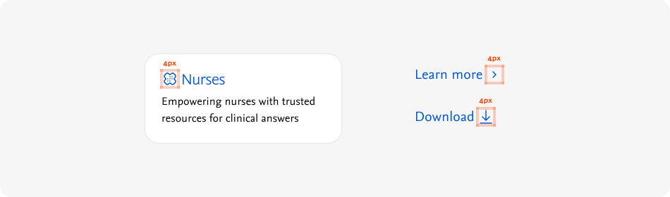
Within the icon frame, all icons have a 2px padding within the icon container to ensure a consistent sizing.

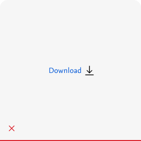
When combining icons with other elements, for example with text in a link, there should always be a mimum of 4px around the icon to ensure ample spacing between elements and optimise legibility. This also fits with our 4px spacing system.
Do's and don'ts
Do
Consistent use of color and stroke thickness within an icon.
Do
Use a the same color icon than the element it's paired with.
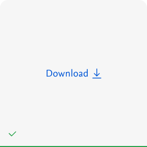
Do
Use icons to give more clarity and indication of what the text refers to.

Don't
Use multiple colors and stroke sizes for individual icon elements.
Don't
Add strokes or background colors to regular icons.
Don't
Use a different color icon than the element it's paired with.
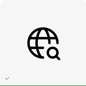
Do
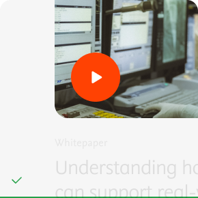
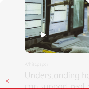
Use media icons when they overlap images or other media.
Don't
Use regular icons when they overlap images or other media.
Icon library
For designers, all icons are incorporated in the Sketch library in the design toolkit. Developers can copy the SVG reference below. Provided by the @elsevier/design-system-icons package.
AcademicCap
ArrowDown
ArrowFirst
ArrowLast
ArrowLeft
ArrowRight
ArrowUp
Calendar
Cart
CaseStudy
ChargingBattery
Chat
Check
ChemistrySearch
ChevronDown
ChevronLeft
ChevronRight
ChevronUp
Clock
Close
ComputerChip
Connection
Corn
Download
Educators
Executives
Expand
External
Filter
Flame
Funder
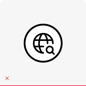
Globe
Grid
Information
Institution
Journal
Librarians
Link
Location
LockOpen
MedicalCross
Menu
Minus
Notebook
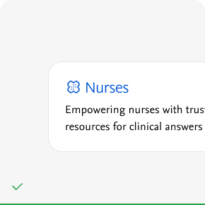
Nurses
Pause
Pen
Pencil
PeopleGroup
Pharmacists
Phone
Physicians
PillBottle
Play
Plus
Podcast
PublicationSets
Radio
Reload
Research
ResearcherGroup
Search
SecondaryResult
Shipping
SolarPanel
SpoonFork
Students
TapeMeasure
User
Warning
Wheelchair
YouTube
Icon names
Please find below an extensive list of all icon names, for use in codebases / content models.
["academic-cap-icon","arrow-down-icon","arrow-first-icon","arrow-last-icon","arrow-left-icon","arrow-right-icon","arrow-up-icon","calendar-icon","cart-icon","case-study-icon","charging-battery-icon","chat-icon","check-icon","chemistry-search-icon","chevron-down-icon","chevron-left-icon","chevron-right-icon","chevron-up-icon","clock-icon","close-icon","computer-chip-icon","connection-icon","corn-icon","download-icon","educators-icon","email-icon","executives-icon","expand-icon","external-icon","facebook-icon","filter-icon","flame-icon","funder-icon","globe-icon","grid-icon","information-icon","institution-icon","journal-icon","librarians-icon","link-icon","linked-in-icon","location-icon","lock-open-icon","medical-cross-icon","menu-icon","minus-icon","notebook-icon","nurses-icon","pause-icon","pen-icon","pencil-icon","people-group-icon","pharmacists-icon","phone-icon","physicians-icon","pill-bottle-icon","play-icon","plus-icon","podcast-icon","publication-sets-icon","radio-icon","reload-icon","research-icon","researcher-group-icon","search-icon","secondary-result-icon","shipping-icon","solar-panel-icon","spoon-fork-icon","students-icon","tape-measure-icon","twitter-icon","user-icon","warning-icon","wheelchair-icon","you-tube-icon"]
Rich media controls icons
Some icons are used in media controls, such as a close or play button. They usually overlap a more complex interface such as a video player or modal pop-up. To ensure an accessible experience, a filled circle with a background color is used to display these icons properly.
Social icons
Icons used for external links to social media use a filled background color to ensure the social media logo is visible.
YouTube
Icon names
Please find below an extensive list of all icon names, for use in codebases / content models.
["facebook-icon","linked-in-icon","twitter-icon","you-tube-icon"]
Gizmo Icons
These icons are from the Elsevier brand guildlines.