Corner radius and borders
To show consistent use of corner radius and borders, follow the values we’ve selected below. We have selected values for different breakpoints to ensure smoothness and consistency. A few examples of elements with corner radius and borders are cards and banners.
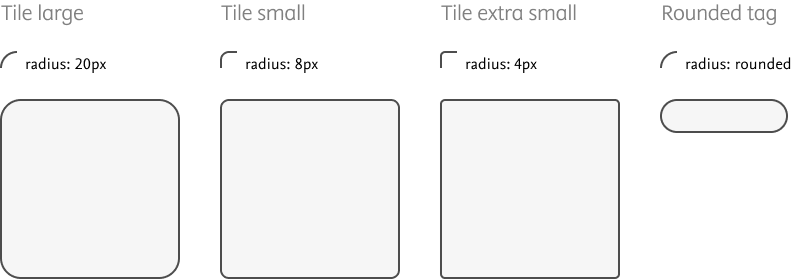
Tile corner radius
Rounded corners are used throughout the designs to create a friendly, inviting look and feel to the UI. We use rounded corners across almost all UI elements from the smallest level (buttons) to the largest level (cards). We do not use rounded corners on photography. All corners use values of 4 to fit with our 4px spacing system.
Preview | Name | Value | |
|---|---|---|---|
4px | 4px | ||
8px | 8px | ||
12px | 12px | ||
16px | 16px | ||
20px | 20px | ||
24px | 24px | ||
none | 0 | ||
default | 4px | ||
standout | 4px | ||
banner | 8px | ||
image | 4px | ||
avatar | 2px | ||
card | 4px | ||
video | 4px | ||
table | 4px | ||
form | 4px | ||
rounded | 24px | ||
squared | 2px | ||
half | 50% | ||
full | 100% | ||
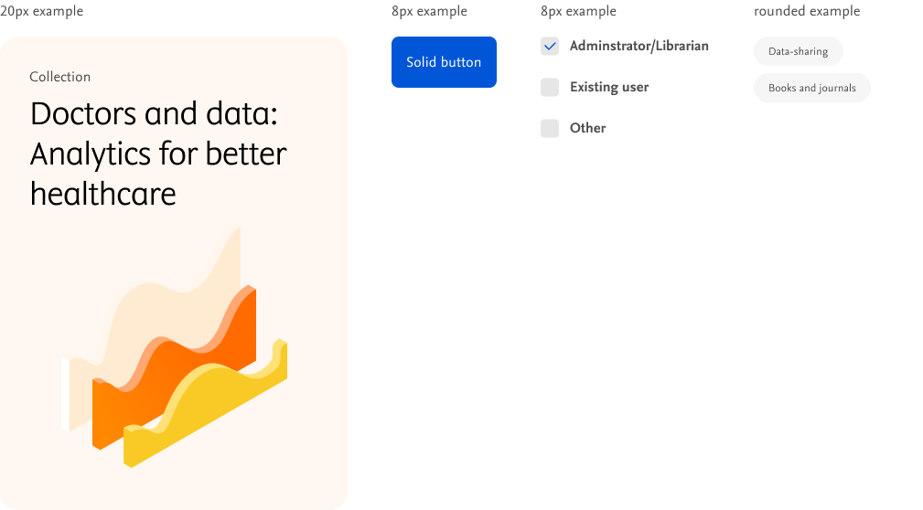
Desktop (L)
Examples
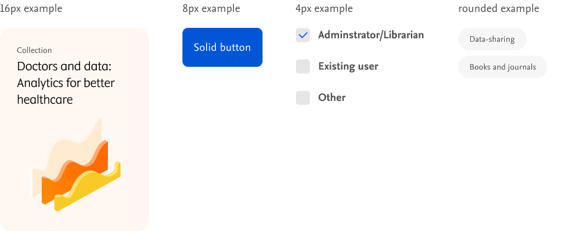
Tablet (M) and mobile (S)

Examples
Tile borders
We use 1px, grey-200 tile border to provide a subtle cue to users across components, while still maintaining the air of simple, clean, and open across UI.
1px solid #ECEBE9
1px solid #0056D6
1px solid #FF551D
2px solid #ECEBE9
1px solid #FFFFFF
1px solid #999999
1px solid #808080
1px solid #2354FF
1px solid #AF1D1D
1px solid #0C8930
1px solid #808080
1px solid #2354FF
1px solid #AF1D1D
1px solid #0C8930
Examples

Do's and don'ts

Do
Use borders to give clarity to individually existing components.

Don't
Combine borders and shadows within the same component.