Getting started
The Elsevier.com Design System borrows and builds off of the design principles from the Elsevier brand guidelines. Sophisticated, robust, contemporary, and emphatic, we are similarly sophisticated, accesssible, modern, and human. Our principles act as a guideline for all design choices as we build out and further refine the design system. It helps us establish a consistent tone of voice, a recognisable style, and clear behaviour. They help bring consistency, coherence and expressiveness across all channels and applications.
Sophisticated
Sophisticated means the designs should be refined and detailed, and layouts should be clear and consistent. Colours and styles should be used sparingly, only to highlight and draw attention. Our design layouts have plenty of open white space, and have refined typography.
Key elements
- Spacious layouts with plenty of whitespace
- Modest application of styling and colour
- Refined typography
- No cluttered layouts
- Avoid excessive styling and use of colour

Human
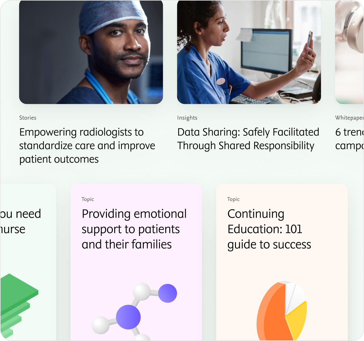
We always place customer needs first. This means we are committed to a high standard of accessibility, honesty, and respect for users. Our designs focus on accessibility and usability first, with human-centric imagery, clear text, and simple, easy to scan and understand interfaces.
Key elements
- Always accessible
- Human-centered imagery
- Easy-to-read text in an inviting, understanding tone
- Avoid complex interfaces and context
- No pictures of spaces and objects

Accessible
We behave like equals - and accessibility is essential to achieving that. Inclusion is an important to us so we strive to empower all people, including persons with disabilities. We do this through ensuring our products and services are accessible and easy to use by everyone.
Key elements
- Sufficient contrast in colour
- Clear hierarchy in layout and typography
- UI components with clear indicators
- Clearly grouped components with consistent spacing
More detailed guidelines can be found in our Digital Brand guidelines on Accessibility
Modern
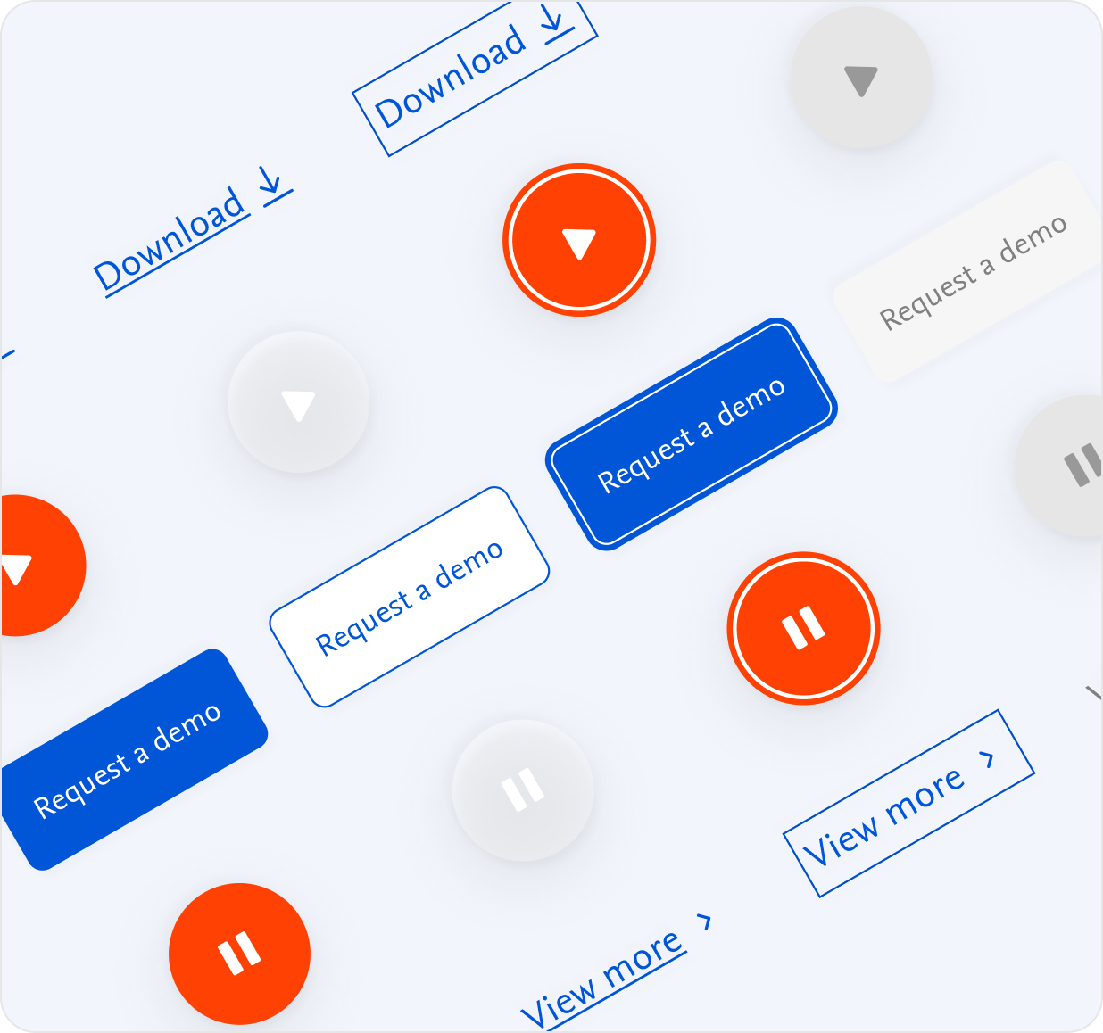
As a data-driven tech company, we aim to look modern and contemporary. This means simple, minimal interfaces. Our visual style translates to clean, refined typography, fresh but modest use of colours, and contemporary photography and illustrations.
Key elements
- Simple, minimal interfaces
- Clean layouts with hierarchy
- Refined use of typography
- Fresh colour palette
- Contemporary photography and illustrations